BEM is a game changer in the CSS naming convention

There are only two hard problems in Computer Science: cache invalidation and naming things
―Phil Karlton
Earlier today while doing research into how best to improve my CSS workflow, I came across BEM. BEM – Block Element Modifier is a methodology that helps to create reusable components and code sharing in front development. What this actually means is that it provides a new methodology to reduce the CSS footprint in a codebase while improving cooperation among developers.
How does BEM do this?
BEM provides a powerful but simple naming convention that improves code legibility, adds robustness and is makes it easier to work with thanks to a strict, explicit set of rules. BEM is an abbreviation. Block - Element - Modifier. A block is a standalone entity with a meaning all on its own. An element is a part of a block with no standalone meaning.It must have an explicit tie to a block. A modifier is a flag on a block or element. It is used to change appearance, behavior or state.
How does the naming work?
Before we take a look at a real world example of how this works, let us take a look at the naming conventions for the block, element and modifier.
Block names may consist of Latin letters, digits, and dashes. To form a CSS class, add a short prefix for namespacing: .block
Element names may consist of Latin letters, digits, dashes and underscores. CSS class is formed as block name plus two underscores plus element name: .block__elem
Modifier names may consist of Latin letters, digits, dashes and underscores. CSS class is formed as block’s or element’s name plus two dashes: .block--mod or .block__elem--mod and .block--color-green with .block--color-blue. Spaces in complicated modifiers are replaced by dash.
A real world example
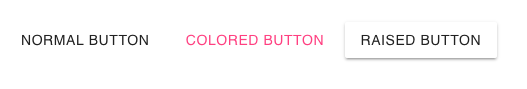
For this example, we are going to use a button from Material Components for the Web We shall take a generic button from the kit and use BEM to customize the buttons as per the naming convention. We shall have a normal button, a colored button and a raised button. How would that look like? Here’s how:
HTML
  <div>
    <button class="mdc-button">
      Normal button
    </button>

    <button class="mdc-button mdc-button--accent">
      Colored button
    </button>

    <button class="mdc-button mdc-button--raised">
      Raised button
    </button>
  </div>
What can we glean from this? First, the block class is mdc-button. This defines the top-level button element. Our button component has no inner elements. However, we are changing the appearance of the buttons using modifiers. In MDC, our provided modifiers for this example are:
mdc-button--accentwhich colors the button with the accent color.mdc-button--raisedwhich elevates the button and creates a colored background.
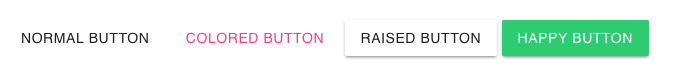
What if we decided to added a happy button that inherits from a basic raised button, but has a green background and white text.
We would only need to change the HTML and CSS this way:
HTML
  <div>
    <button class="mdc-button">
      Normal button
    </button>

    <button class="mdc-button mdc-button--accent">
      Colored button
    </button>

    <button class="mdc-button mdc-button--raised">
      Raised button
    </button>

    <button class="mdc-button mdc-button--raised mdc-button--happy">
      Happy button
    </button>
  </div>
For the CSS, all we have to do is add the necessary attributes for the happy modifier
CSS
.mdc-button--happy{
    color: #fff;
    background: #2ECC71;
}
And now we have our new button alongside the others. We managed to keep our CSS clean and legible while only adding an class to the HTML. I hope you enjoyed learning this as much as I did.